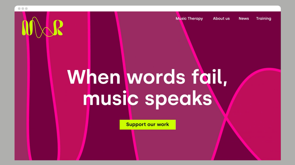
What is it? An identity overhaul by Pentagram for Nordoff and Robbins, the UK’s largest music therapy charity.
What I liked Colour palette - the muted tones contrasted with vibrant saturated colours.
The logo - I love the curvy chunky letters contrasted with the lines that mimic sound waves. It feels so connected and dynamic.
I love that the design has created an impact and drawn attention to the concept of music therapy, which I didn't even know existed as a field until this.


Комментарии